Map Creator
I’ve always liked transit maps. They not only help us get from A to B, but can also tell a story about a city. Well designed transit maps not only serve a utility, but are also public art.
There’s lots of different types of transit maps, but the most common is the London Underground schematic style. I’ve wanted to design one of these for myself, but I’ve never had the patience to make one using Illustrator or Figma. I don’t think these tools are particularly suited towards transit maps. We should be able to define a map the same way the routes are defined—it should be as simple as specifying the nodes and connections.
We’re currently in lockdown here in New Zealand, so it does feel a bit silly to work on Waka at the moment. Instead, I spent the last couple of weeks building a tool to help make drawing transit maps easier. The first step was the most basic scenario—a single line, with a bend in it.
Simple enough. Just draw a line, and use a bit of trigonometry to figure out the coordinates for the angles. Cool. Now, what happens when we add a second line?
It turns out, the lines overlap. This is because the lines have a width, so you need to account for that when you bend lines. I’ve made the diagram above a little bit transparent, so it’s easier to see this issue. Again, with a little bit of trigonometry, I was able to fix this all up.
The lines of transit maps often swap over when the angles of the line change, so this was the next thing I accounted for. It’s a little bit difficult, as you also have to account for the change in length of line. Nevertheless, after a bit of hair pulling, I got the result I was after:
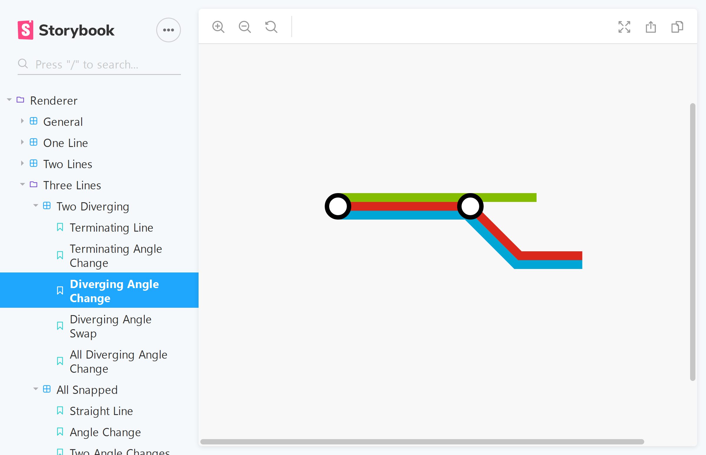
Things get more and more complicated the moment you introduce 3, 4, 5+ lines. Modifying an equation to fix one case, will often break another. To keep track of all these different scenarios, I used Storybook and wrapped everything up as a web component.
As the application essentially runs a Breadth-first search and outputs a SVG, I decided against using a framework like React, Vue, or Angular for now. Web components were the perfect lightweight solution I needed.

By regression testing any small tweak to my code, I was able to come up with a general solution for any angle, any number of lines, and any change in stacking. As a bonus, I was able to delete lots of code once I arrived at my pair of equations!
Currently, it won’t stop you from making a bad looking map, but at least the angles will be correct! The other nice thing about getting all the math right is that you can easily change the look by modifying a few parameters.
I’m not totally sure where I’m going to take it next, but there’s a lot of room for improvement. I might try replicating a couple of real-life maps, and seeing how far I get. At the very least, I’m going to have to add labels for stations!
- Previous: Waka Local Guidebooks
- Next: I bought some things


