Waka Commuter
I recently built a data visualization for a NZ Census data competition, and ended up winning! I figured I would go through some of the thinking behind it, as well as how I built it.
Congrats @consindo! Using Census data, Jono has developed a very cool way of showing where people all over NZ (usually) travel to and from for work and study. https://t.co/oAamoSmVjB https://t.co/ieIv9LbW4h
— James Shaw (@jamespeshaw) August 14, 2020
The idea #
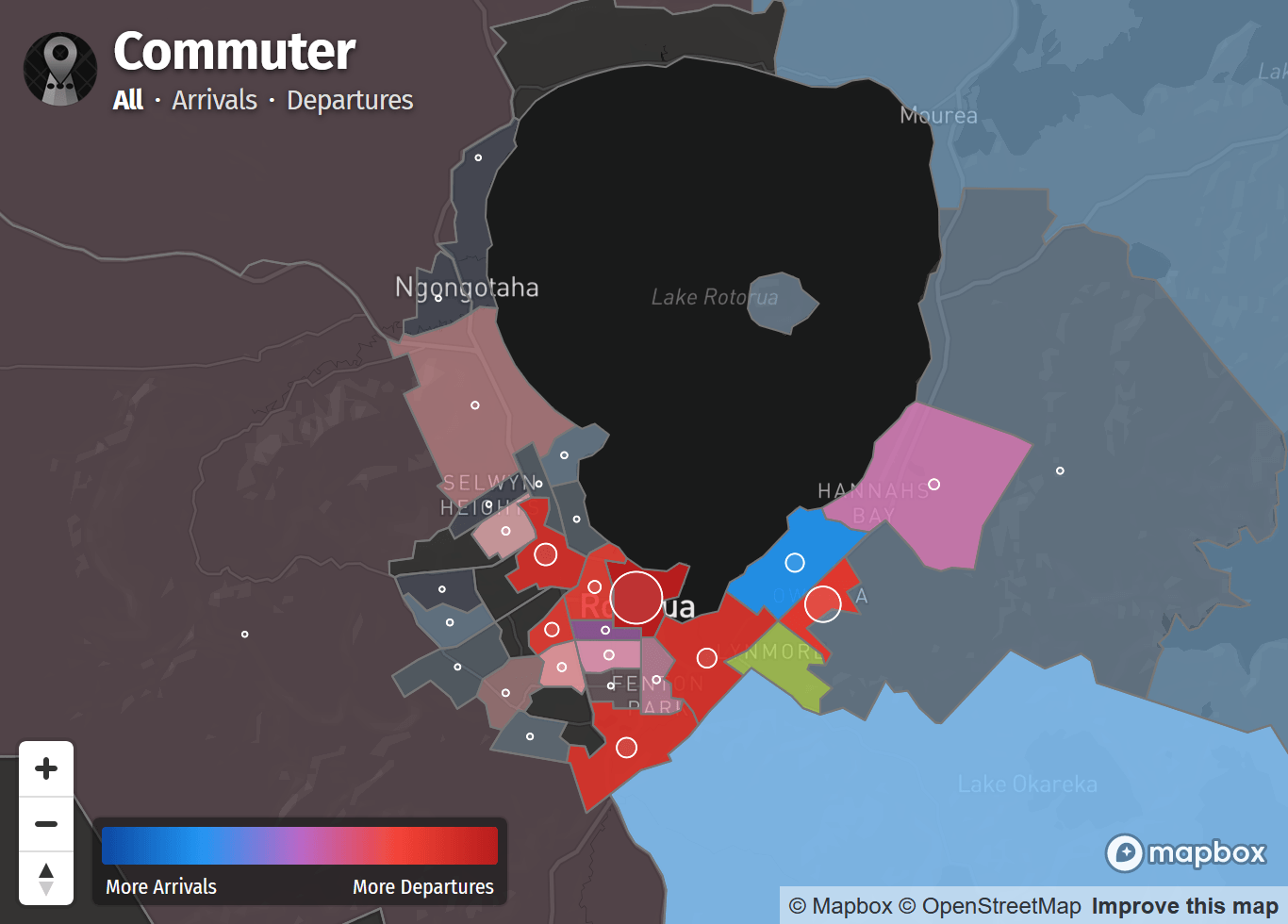
My overall goal with the app was to make the commuter view data as accessible as possible, so I started by creating a visualization familiar to many people: an election map. Elections can be quite binary, so I found that this visual representation translates well to arrivals & departures for a geographical area. While colours are pretty, I also wanted make this tool useful to real people, so I added some additional insights to complement the main map.

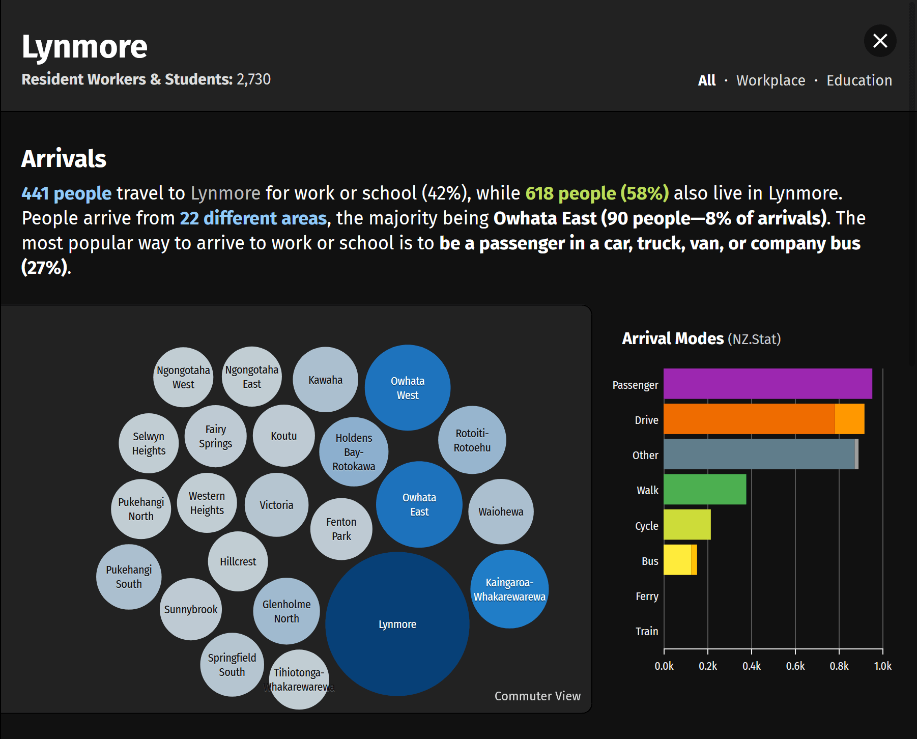
Upon selecting a region, you’re presented with a text summary and a more abstract bubble view of arrivals & departures. This visualization still aims to be roughly spacial, but ignores land area and uses commuter volumes instead. A chart showing the overall travel modes is also included as this can provide additional context to people’s travel patterns. Due to data suppression, I was not able to use the commuter view dataset, and used the aggregated census data instead.

I included options to filter by arrivals/departures & work/education. Patterns can be quite different, so it’s fun to toggle the options and see the visualizations update in real-time! As the SA2 boundaries are small, you can also Ctrl+Click to multi-select and view insights for larger areas (e.g an entire city centre).
Lastly, I ensured the app worked on mobile devices to make it accessible to the largest number of people. A few features are omitted, but is still useful and should encourage people to try the app on a PC for more detailed insights.
How I built it #
Quickly. It’s not my best work, but I’ve open sourced it on GitHub anyway. I had a couple of goals though, and they informed the tech I used.
Serverless #
Databases are great, but they can be expensive to run. It’s also just something to maintain, and I really want this app to work forever and not worry about it.
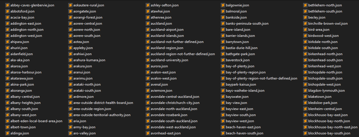
As the dataset doesn’t change (except when there’s a new Census!), I wrote some scripts to process all the data and output a JSON file for each area unit. You end up with a lot of files (2,474), but it becomes a psuedo-API.

I ended up using Netlify to deploy it, mostly because I can’t use GitHub pages with more than one custom domain (already using it for this site). I’m impressed though—you just point it to your GitHub repo, it builds everything really quickly, and then kinda just works—SSL etc is all sorted. I’ll definitely be using it more in the future.
Maps #
Waka currently uses Leaflet, but I decided to use mapbox-gl-js for this project. I’m happy I did though, as vector maps provide a much better user experience—it not only loads faster, but you can zoom to any level, animate smoothly, rotate etc. I would love to find some time to move Waka over to vector maps in the future.
It has a pretty nice styling system, that’s almost like writing a stylesheet for geojson. You define what you want it to look like when the data meets certain conditions, and it more or less just works.
The only other thing to note is that I optimized the SA2 boundries, as they are all loaded when the user loads the app. I ran the dataset through mapshaper.org, and it simplified the geometry somewhat. I also ripped out the unnecessary metadata, cut the filesize from 21MB to 945KB gzipped as a result.
Visualizations #
I spent a few hours experimenting with other libraries, but at the end of the day, the only viable option was D3.js. I really struggled through this, spending a lot more time on building the simple bubble & bar chart than I should have. As a result, the charts are much less interactive than I would like—you can hover & click on them, but not much more.
I wrapped all my mess up in some Web Components (via lit-element), which really simplified things. I bound plenty of event handlers on the map as well as other buttons in the UI, and then just had to update attributes on the components to get everything to update nicely. In a way, it kind of works like a jQuery app from 10 years ago.
That’s kinda it! Not much to it—more time was spent on the thinking & design than the coding itself. That’s the way it should be though—start with your customer outcomes, and the tech just becomes a means to create a solution.
Feedback #
Have you used Waka Commuter? Give it a try, and I would love to hear what you think—reach out to me on Twitter @consindo for any feedback. As it’s open source, also feel free to play around with the code, or even raise a pull request.
- Previous: The best NZ debit & credit cards of 2020
- Next: Same Scale