Commuter Waka
Several years ago, I built a data visualisation for NZ census commuter data. It ended up winning the competition, and recently I was asked to update it for the 2023 Census.
In the background, Commuter Waka has actually been quite successful. I’ve received feedback from people working at local councils & transport consultancies, and have had a few requests for features over the years. I was able to incorporate some of these into the new visualization for the 2023 data, so it has become quite a substantial upgrade all around.
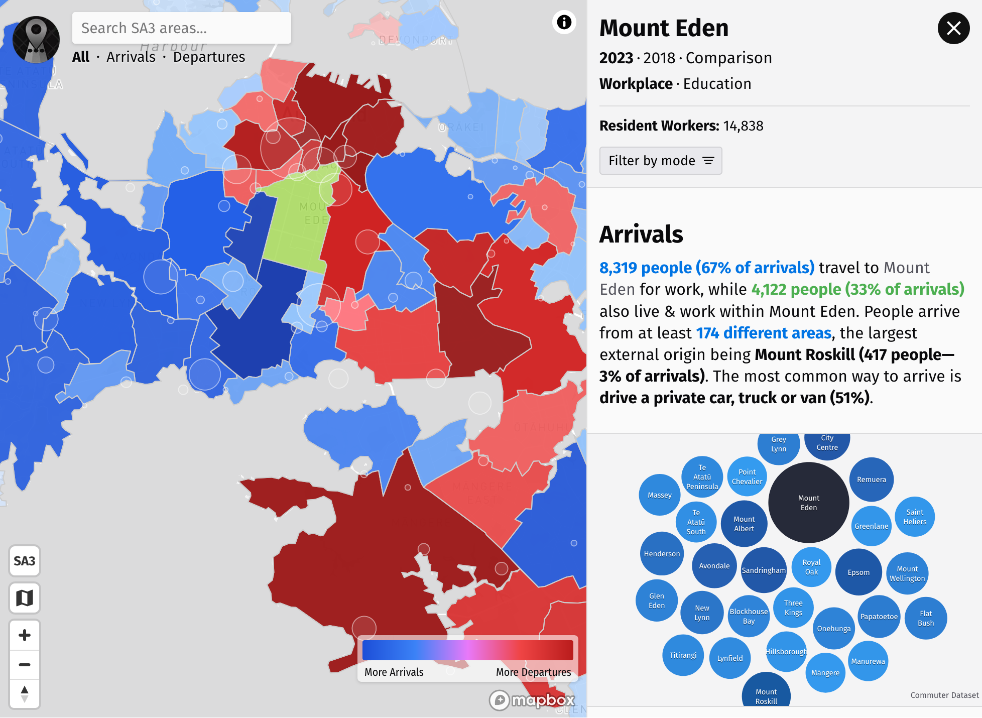
New features include search, filtering by mode, comparison between different years, light/dark mode, more map display options, and new charts. I was able to work with Stats NZ this time around, so a few tweaks have been made to ensure that the visualisation accurately represents the data.
Notably, you can no longer select multiple areas at the same time. Due to how data is anonymized, adding values from different areas together can lead to misleading & inaccurate results. A mode which aggregates to the SA3 level has been added, which offers most of aggregation benefits while staying accurate.
Over the years, I’ve also received several requests for custom maps (please reach out if you want one!), so I’ve been able to improve the code over time. I would no longer describe the code as a mess, and is now using Svelte to power things. I really like the way you can use D3 where you use Svelte to manage the DOM, but D3 for the calculations for the visualisation. Other than that, the way things work overall in the original post remains the same.
Commuter Waka is still open source on GitHub. Feel free to send me feedback or raise a pull request!
- Previous: Expo 2025
- Next: A roadtrip around Greece