Building the Apple Maps drawer with CSS
I’ve always really liked how Apple Maps works on iPhone. There’s a persistent drawer on the screen that allows you to toggle between the map, place information, or view both at the same time. It’s a really good multitasking user experience, and this same pattern is used in a few other iOS apps such as Music & Find My.
While Google Maps also ships something similar, it’s not as consistent as Apple’s implementation. In Google Maps, the drawer design changes depending on what you tap on, and the app loses its place if you move the map. It’s almost like you can feel the many different teams working on Google Maps and they’ve all implemented their UI slightly differently.
I’ve implemented something similar in the past in Waka, but it was quite complicated due to fewer CSS features available at the time. It used a lot of JavaScript to handle gestures and animations, but today we can build the same thing without almost no JS at all.
How does the Drawer UI work? #
Note: I’m using pre iOS 26 screenshots, as they demonstrate these states better.
The drawer has three primary states. The first state is when the drawer is fully collapsed. The map can be interacted with, and only the header of the drawer is visible. You can drag the drawer header to move to one of the other states.
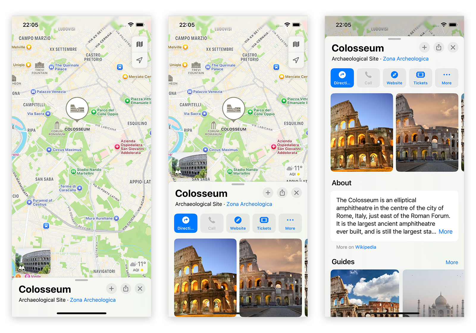
The second state is when both the map & drawer are visible. Both the map and drawer content can be interacted with. However, scrolling the drawer content will move the entire drawer to either the fully expanded or fully collapsed state.
The final state is a fully visible drawer, with only a small portion of the map visible and not intractable. When scrolling the drawer content, the header stays sticky so the drawer can be collapsed without scrolling to the top. Scrolling past the top of the drawer content will close the drawer.
Back & forward navigation is also represented through animation. Navigating forward to a new page triggers a new drawer to transition in from the bottom of the screen covering the existing drawer. Navigating back runs the animation in reverse, while in-place navigation does not trigger an animation.
1. Using CSS scroll snap to create a drawer #
First, we’ll start with some HTML. We define an area for the map, the drawer header & content, and a few elements to wrap things all together.
To keep things simple for this example, we’ll just use a scrollable image to substitute for our map, rather than bringing in Mapbox or a similar library.
<main>
  <div class="screen-top"></div>
    <section class="main-wrapper">
      <div class="main-content">
        Your map or other content
      </div>
    </section>
    <div class="drawer">
      <header class="drawer-header">
        <div>
          <h1>East West Line</h1>
          <p>Manukau to Swanson</p>
        </div>
      </header>
      <section class="drawer-wrapper">
        <div class="drawer-content">
          The East West line runs every 7 minutes during peak times, and at 15 minute intervals all other times.
        </div>
      </section>
    </div>
  </main>
To get this started, we set snapping to be mandatory on the html element, and define three different snap points.
- On our
.screen-topelement. This is at the very top of the screen, so our drawer will be completely collapsed (--collapsed-height). - On the
.drawer-header. This hasscroll-margin-topset, so it snaps18remfrom the bottom of the screen. - On the
.drawer-wrapper. This is our fully expanded view, with the drawer header at the top of the screen. We need to usescroll-margin-topagain to account for the header.
html {
  scroll-snap-type: y mandatory;
}
:root {
  --screen-height: 100svh;
  --drawer-top-margin: 2rem;
  --drawer-midpoint: 18rem;
  --collapsed-height: 4rem;
}
.screen-top {
  scroll-snap-align: start;
}
.main-wrapper {
  /* we don't want the map to move when the drawer is moved up/down */
  position: sticky;
  top: 0;
  z-index: 0;
  height: var(--screen-height);
}
.drawer {
  z-index: 2;
  position: relative;
}
.drawer-header {
  scroll-snap-align: start;
  scroll-snap-stop: always;
  scroll-margin-top: calc(var(--screen-height) - var(--drawer-midpoint));

  /* we overlay the drawer on the map, so we can use border-radius */
  margin-top: calc(var(--collapsed-height) * -1);
  height: var(--collapsed-height);
}
.drawer-wrapper {
  scroll-snap-align: start;
  scroll-snap-stop: always;
  scroll-margin-top: var(--collapsed-height);
}
Putting it all together (and with a few extra visual styles), we end up with something that looks like this. It is starting to take shape!
2. Scroll Driven Animations #
While this is looking close to the desired UI, there are a few issues. Firstly, in our fully expanded state, scrolling further should maintain a sticky header at the top of the drawer. While we can use position: sticky, we still want the map to remain a little visible at the top of the drawer. If we use a value that is greater than top: 0, the content will pop out the top of the sticky header and over our map.
To fix this, we need to introduce another scrollable container. We set a height on the drawer wrapper, and allow the content to scroll.
.drawer-wrapper {
  height: calc(100dvh - var(--collapsed-height) - var(--drawer-top-margin));
}

.drawer-content {
  overflow-y: scroll;
  height: 100%;
}
While this fixes the fully expanded state, the partially expanded state now has the content scrolling independently of the drawer. We need to disable scrolling of this container unless the drawer is fully expanded.
In the past, we may have used something like the IntersectionObserver JS API to control this, but we can now use CSS scroll driven animations to do this without any JavaScript.
html {
  scroll-timeline: --page-scroll block;
  scrollbar-width: none;
  overscroll-behavior: none;
}
@keyframes drawer-content {
  0% { overflow-y: hidden; }
  99% { overflow-y: hidden; }
  100% { overflow-y: scroll; }
}
.drawer-content {
  animation: drawer-content auto linear;
  animation-timeline: --page-scroll;
}
To polish this off, we can also use this same scroll-timeline to slightly dim the map and disable interactivity when the drawer is fully expanded.
@keyframes main-scroll-opacity {
  0% { opacity: 1; }
  90% { opacity: 1; }
  100% {
    opacity: 0.7;
    pointer-events: none;
  }
}
.main-content {
  animation: main-scroll-opacity auto linear;
  animation-timeline: --page-scroll;
}
And after inserting a scrollable image to use as a map, we’ve got a drawer that works in a similar fashion to Apple Maps. Now we just need to animate it.
Compatibility: At time of writing, CSS scroll driven animations are not supported in Firefox. On iPhone, you’ll need to be on at least iOS 26.
3. CSS View Transitions #
While there’s plenty of JS animation frameworks, we can now use CSS View Transitions to handle our navigation animations. This is reasonably straightforward: we give our .drawer a view-transition-name and define a couple of animations using the view transition psuedo classes.
Because the drawer has three different heights, we also need to account for this with some variables and another scroll driven animation.
@view-transition {
  navigation: auto;
}
@keyframes drawer-height {
  0% { --current-drawer-height: var(--collapsed-height); }
  /* variable values are discrete, so we don't need to be accurate with our percentages */
  10% { --current-drawer-height: var(--drawer-midpoint); }
  100% { --current-drawer-height: calc(100dvh - var(--drawer-top-margin)); }
}
html {
  animation: drawer-height auto linear;
  animation-timeline: --page-scroll;
}
@keyframes slide-drawer-in {
  0% { transform: translateY(var(--current-drawer-height)); }
  100% { transform: translateY(0); }
}
@keyframes fade-drawer {
  0% { filter: brightness(1); }
  100% { filter: brightness(0.95); }
}
::view-transition-new(drawer) {
  animation: 350ms ease slide-drawer-in;
}
::view-transition-old(drawer) {
  animation: 300ms ease fade-drawer;
  filter: brightness(0.95);
}
.drawer {
  view-transition-name: drawer;
}
Because we’re using cross document view transitions (i.e navigating to another page), the drawer will collapse upon navigation. We’ll need to add a tiny bit of JavaScript to maintain the scroll position. If you’re using this in a single page app with document.startViewTranstion, you won’t need this code.
If the user hits the back button, the animation looks a little weird. We’ll need to reverse it on backward navigation. To do this, we also need to add a little bit of JavaScript to add a backward view transition type, and some extra CSS for the reverse animation.
window.addEventListener('pageswap', () => {
  sessionStorage.setItem('scrollTop', document.body.parentElement.scrollTop)
})

window.addEventListener('pagereveal', () => {
  // restore scroll height when navigating between pages
  const oldScrollHeight = parseInt(sessionStorage.getItem('scrollTop') || '300')
  document.body.parentElement.scrollTop = oldScrollHeight

  // detects if the back button is pressed
  if (!viewTransition) return // not supported
  const { navigationType, entry, from } = navigation.activation
  const isBackward = navigationType === 'traverse' && entry.index < from.index
  if (isBackward) viewTransition.types.add('backward')
})
html:active-view-transition-type(backward) {
  &::view-transition-new(drawer) {
    animation: 300ms ease fade-drawer reverse;
    z-index: 2;
  }
  &::view-transition-old(drawer) {
    animation: 350ms ease slide-drawer-in reverse;
    transform: translateY(var(--current-drawer-height));
    filter: none;
    z-index: 3;
  }
}
And after a bit of styling, this is the final product!
NB: If you hit the close button too many times, it’ll navigate you away from this blog post. Scroll restoration of the image is also not handled in this example.
Notes #
We’re a little limited with some features that CSS provides, so this not a perfect replica. I would love to adjust the scroll snap speed, but there isn’t currently a way to do that. While it does work with a mouse, it is optimized for touch screens. It may be worth adding in some JavaScript to aid mouse users, and to adjust the layout to a two column design on larger screens.
It’s also worth mentioning that using backdrop-filter: blur(x) for a transparent blur effect (before iOS moved to Liquid Glass) is currently a bit glitchy with view transitions, so this demo avoids transparency.
This is also a little glitchy in different ways on both iOS and Android when not running in an iframe (due to dynamic toolbars on mobile). The easiest way around this is probably to disable scrolling on the html element and make main a scrollable container, adjusting CSS rules accordingly. The mobile browsers will always have toolbars present, but it should avoid weird layout reflows.
Other than that, I’m happy with how this turned out and I will probably implement it in some of my projects. Feel free to use it in your own!
- Previous: Autumn in the UK